HyperOS Initial review
 Jan 1, 2024
So Xiaomi finally pushed the OTA HyperOS to the 13T Pro, and luckily since I live in Europe, I get priority over everyone else and I got the update ahead of everyone else. In fact, I got the update right after it was announced on a telegram group, which is a huge relief.
Initially, I had some concerns about apps, since I have a lot of HyperOS ported apps, but after updating, I found that there’s no issues and none of the apps conflict, which is amazing. I did have to uninstall an old version of File Manager and Calendar, but those were minor things. I’ve yet to see if I get app updates via the settings app, but I’m hopeful.
One thing that I immediately disliked was the inclusion of GetApps. I despise the fact that Xiaomi had to include their app store in this despite the fact that it wasn’t there on EEA MIUI. I find it a bit annoying and I wish they’d stop this, but what can you do
However, I really like what they’ve done with the rest of the phone.
The haptics just went from great to AMAZING. They really went for greatness with them, it feels awesome. Haptics no longer feel the same for everything, they now have varied levels of “pitch”, if that makes any sense. And it’s amazing.
The main feature of this update is the lockscreen customisation, which I really like. It looks great, and mixed with a good AOD, it’s even better. What I do miss is the different locksreen to homescreen animation, which is present on a ported rom on my old redmi, but not on here. Still, it’s awesome and I’m a huge fan
But arguably even better than the lockscreen is the insane UI overhaul. It’s awesome. They’ve gone ahead and made everything look so much better than MIUI. There’s now an actual design language to it and it feels amazing. I also like the more detailed icons, as they somehow look better than a very minimalistic style. Also, a huge benefit is the advanced textures, they are disabled by default, but they look awesome. According to Nightlake, it might drain a bit more battery, but I’ll have to test that out in my daily use to tell for sure.
In general, the new UI feels much more refined and there’s so many minor things that I really like, such as the new media player design
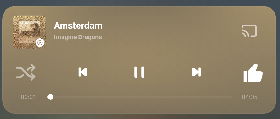
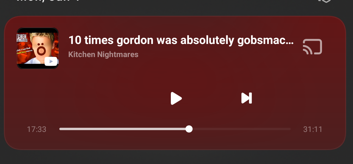
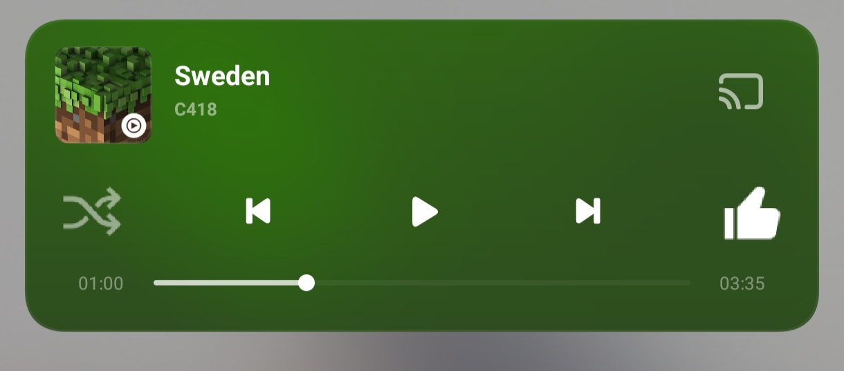
Here you can see how it looks for Youtube Music and Youtube, there is a minor difference, but it’s still a really good design. I also like how the colours adapt to what the media is
You can see how the different track made the colour different.
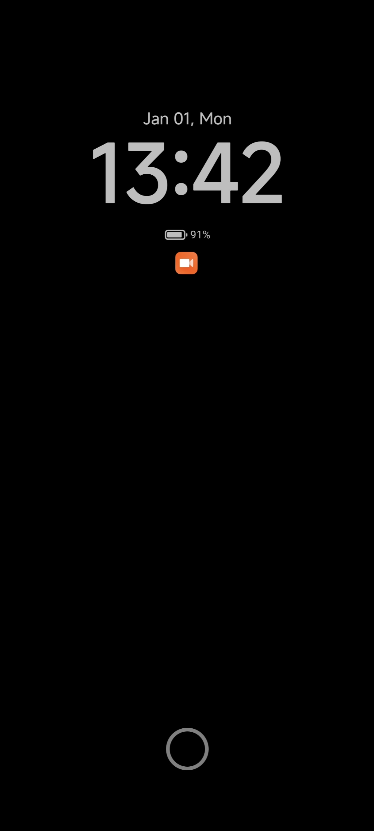
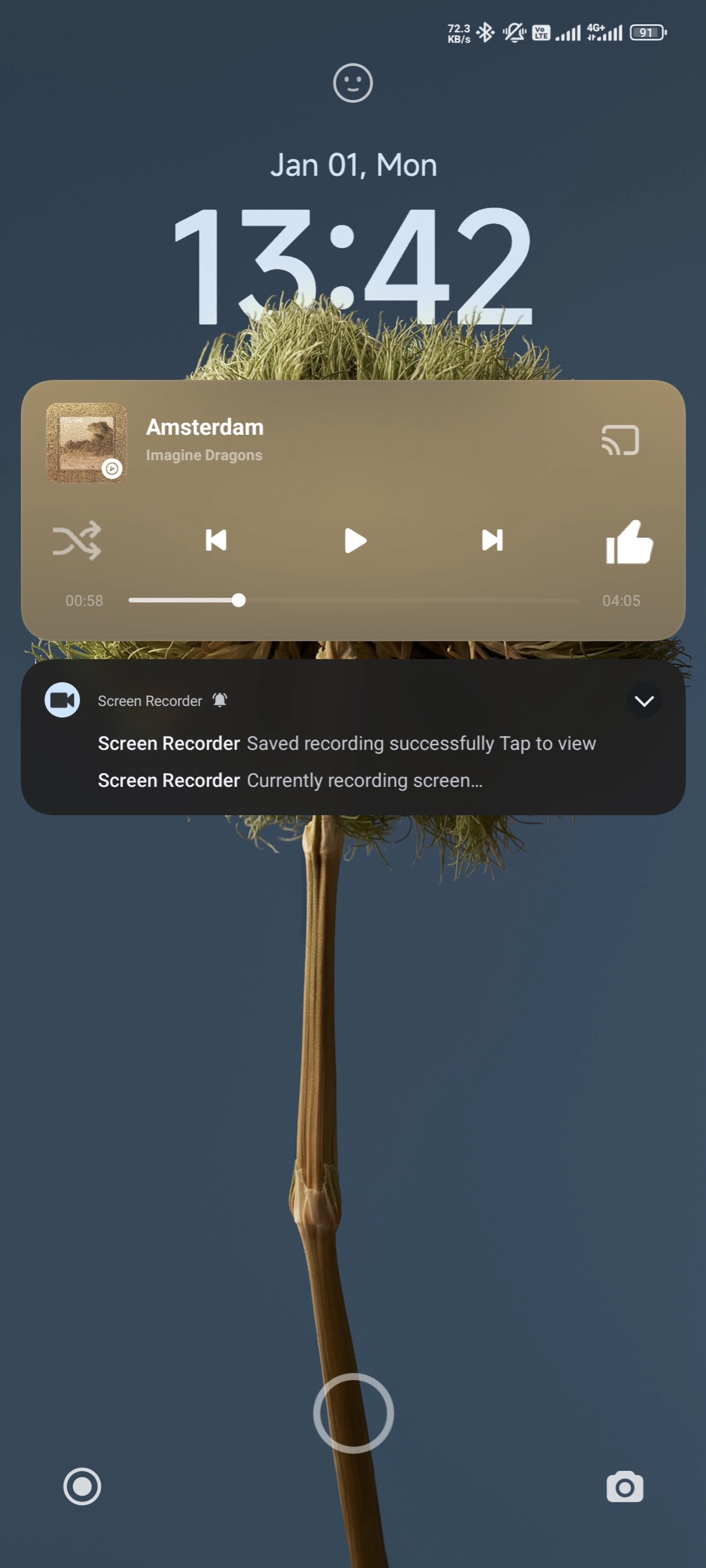
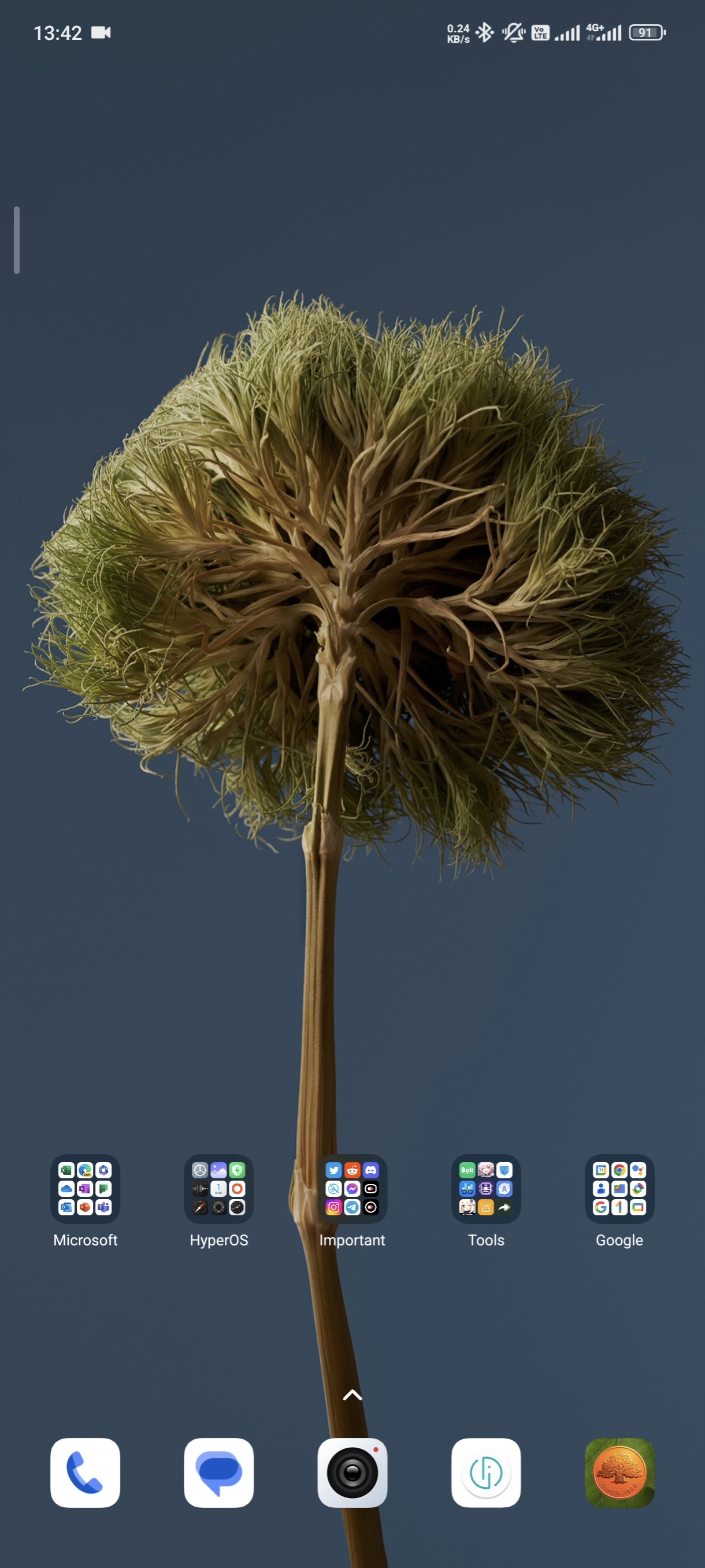
Here’s how AOD, Lockscreen, and Homescreen, respectively, look. I can’t embed a video, unfortunately, but it’s a great UI.
But there are still a few issues.
First, it’s missing a few features. A minor thing, I know, but I need all the features, not just half of them!
But that’s a small issue. The bigger one is there’s about three or four frames during which the gaussian blur of folders becomes invisible when closing an app, after which it reappears. Also, no gaussian blur when opening/closing apps.
But so far, that’s all I’ve got regarding issues.
I know it’s quite a short review, but there’s not much new stuff to talk about, albeit a lot of stuff has been made better.